So, I scoured eBay for a great deal, and had this baby shipped all the way from Japan:

As a wedding gift to us, one of my coworkers who is a graphic design ninja, designed our invitation and response card.
On Saturday evening, I got to work:

Little did I know (since the instructions were in Japanese), that this sucker needed new batteries. After a quick trip to the local gas station, we were once again ready to make our screen.

Voila! Now you just peel the design off of the back, ink it up, and begin printing.

Okay, kids, now what have we learned? Now we see that a) the blue ink is too dark, so we'll have to custom mix a lighter shade, b) the white ink doesn't appear well on the green paper, and c) the font is much too small --- it's blurry and doesn't take up much of the card.
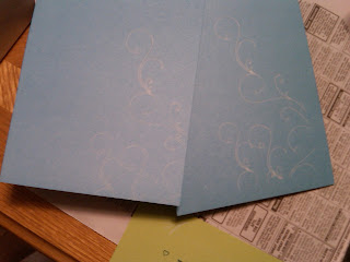
Since I was still trying it out, I thought I'd see what the design on the actual invitation would look like:
Aaah. Another "teachable moment." Design too blurry, needs to be sharpened. White still a little light, should probably be embossed. Also, must work on centering skills.
In short, we'll be reworking the design a teensy bit, I'll sharpen it up, and I'll get back to work. Also, I've decided to emboss the entire suite so the ink is raised, which will add many, many more man hours to the project. Good thing Tom's done with finals on Wednesday... ;)
Anything I missed? Questions, comments, compliments??? :)


1 comment:
Congrats on the hard work! I tkink it will be perfect with your tweaks!
Post a Comment